D-Ticket App: Onboarding Redesign for More User Trust
UX/UI redesign of the registration flow. Autonomous UX analysis to uncover critical logic errors, followed by a complete transformation of the onboarding into a transparent UX structure.
Project/Product:
Deutschlandticket App
Goal:
Build trust in the onboarding flow
Team Composition:
Lead Designer, UX/UI Designer
Role:
UX/UI Designer
Why this case study matters for your
Conversion Rate.
If you are looking for a UX/UI designer, you probably know these challenges:
Users drop off during app onboarding. Noticing clear drop-offs at the first moment of contact? The exact reasons remain in the dark.
Lack of trust (trust barrier). Especially with sensitive data, users bounce immediately without clear trust.
Unclear stores. Your app store screens fail to bring your value proposition (the actual core benefit) to the point immediately.
What you will see in this case study
This case study shows how to pragmatically solve fundamental UX problems without a massive research budget and without exact KPI dashboards. You will learn the following:
Trust through Design ("Trust First")
How a radical redesign approach in onboarding breaks down psychological hurdles to convey security and transparency from the very first second, instead of putting the user directly under purchase pressure.
Audit of the existing User Flow
I will show you how I broke down the old onboarding flow to find the exact friction points—like the "Sales-first Labyrinth" and the sudden login blockade ("The Brick Wall"), that caused users to drop off.
Store- & Onboarding-Alignment
How the visual storyline of the app store screens seamlessly transitions into a logical, stress-free onboarding flow to meet user expectations and minimize drop-offs.
Ready to see how it was done?
Problem
The Deutschlandticket app was losing users in the onboarding area. Management's announcement was short and vague: "The app is losing massive amounts of users during onboarding. We need to look more official and trustworthy to keep people."
What didn't work?
New Customer Registrations: The app's most important revenue driver (ticket purchases) was losing users heavily before they could even buy their first ticket.
Trust & Brand Identity: Instead of acting as an official partner of the transport companies, the interface looked like an aggressive marketing trap.
The Conversion Flow: The process was a "sales-first labyrinth" that overwhelmed users with purchase requests and destroyed trust.
Challenge
With the Deutschlandticket, users have usually already decided to purchase before downloading the app. They no longer need to be convinced of the product.
The real challenge was: How do we prove to the user from the very first second that this app is the fastest (convenience) and safest (official authority) option for their subscription?
💡 Business Impact
For the company, an extreme amount is at stake: The firm receives a 10% commission for every completed subscription.
Every acquired user thus secures predictable, recurring revenue. When users drop out of onboarding out of frustration, expensive marketing budget is burned directly.
Since the drop-off is not caused by the product itself, but by a lack of trust within the flow, every UX vulnerability directly jeopardizes the company's revenue commission.
Discovery
Approach
Research is normally my bread and butter. Can you do it without? Sure, if you want to play a game of chance. So how do you work with a statement like: "There are already some numbers out there, so let's just redesign it now"?
Research budget? 0. KPI dashboard? Nope. To avoid just designing blindly, I started by sitting down for desk research. Upon taking a closer look at the material gathered by the team, critical misinterpretations stood out to me.

Abb: Collected material by the lead designer, mapping user Assumptions against benchmark studies from the Baymard Institute and Nielsen Norman Group.
Not only were the Baymard metrics misinterpreted—overlooking the critical 19% trust-related drop-offs—but standard e-commerce patterns were also blindly applied to a subscription app. This was the moment I decided to completely re-audit the entire sign-in flow.
Onboarding

Old Appstore Screens

Global UX Insights
What defines a good onboarding experience? A look at general onboarding statistics reveals fascinating patterns that address our core problem perfectly:
It is about the outcome, not the features.


Which Categories Personalize during Onboarding ?

How do the others do it?
I took a look at the onboardings of direct competitors on the market—Allride, Transdev, and Mopla and threw a glance at app store search behavior.

Allride

Transdev

Mopla

Appstore Suche
💬
Everyone gets straight to the point. Little to no onboarding. Hansecom shows up quite late at the bottom in search results
The competition is buying up the market: Providers like AllRide and Transdev run targeted paid search ads on keywords such as "dticket app", intercepting the user right at the moment they have acute purchase intent.
Radical focus on conversion: Because these ads cost a tremendous amount of money, the app has to convert the user as quickly as possible afterward. That is why almost all competitors follow the rule: "Everyone gets straight to the point, with little to no onboarding." Every hurdle here would mean burned advertising budget.
The Insights
💡 The Strategic Pivot
Paradoxically, the previous strategy attempted to artificially hide the main hurdle (the login for the subscription model) and bloat the flow with explanatory loops. The result was a fatal breach of trust at the end of the flow.
The Design Brief for Implementation
The guiding principle for the upcoming optimization is: Away from false expectations, towards radical transparency to secure the 10% revenue commission with every download.
4 Insights Serving as the Foundation for My Flow Optimization:
Personalization: Data and competition unmistakably show that hardly anyone personalizes in this sector. With a standardized product like the Deutschlandticket, there are no preferences to query. Competitors therefore often just throw a soulless standard product at the user. This can be an opportunity in this case. Instead of artificially bloating the flow, we use the focus for the most important thing, a serious atmosphere and positioning as an official transport operator partner and thus radical transparency to stand out from the market.
The fierce battle for organic users: Since the competition runs expensive search ads, their onboarding is radically optimized for speed to avoid burning advertising budget. Because we attract purely organic users, we must not chase them through an artificial maze, otherwise they will immediately migrate to faster competitors.
Acceptance of framework conditions: Since the underlying technical sign-in flow, mandatory account creation, and screen sequence are rigidly predetermined by the system, I could not shorten the process itself. My task for the conception phase must therefore be to lower the cognitive load within this fixed framework.
Solution
After several iterations, three fundamentally different approaches emerged, each with a different answer to the same question: What makes users trust the Deutschlandticket app?
Improvements Despite Restrictions


Since the flow after the onboarding screens was already fixed, I focused on what I could influence. The three "Buy" calls to action on the entry screen created pressure instead of interest.
The "Buy now" button and the label "Buy your ticket" were completely removed. Instead, a simple arrow button leads further. This is more neutral, inviting, and without obligation. The user is drawn into the flow rather than being rushed into a purchase decision.

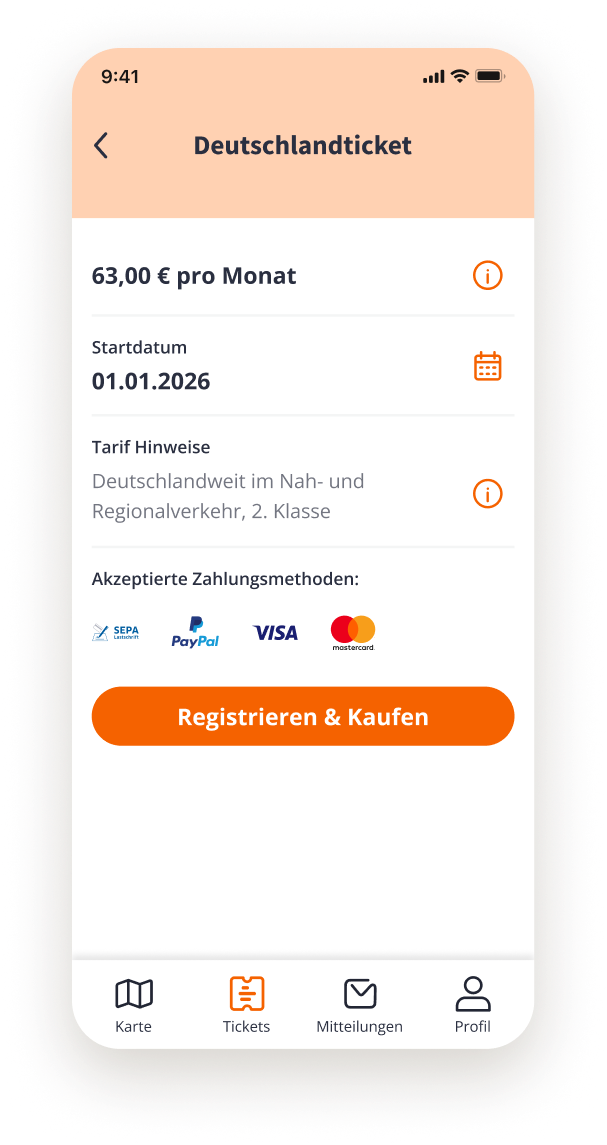
The exact same problem occurs in the next step. The final CTA and header "Buy now" conceal what will actually happen next: a registration. Renaming them to Deutschlandticket and "Register & Buy" sets the right expectation and removes the surprise that otherwise leads to drop-off.
"Payment methods" as a label with the logos underneath implies a pending decision. "Accepted payment methods," on the other hand, is purely informational, allowing the user to see what is possible without feeling pressured to commit.
If I could have changed the flow?
"The actual problem was the login roadblock.
I would have simply built registration right into the purchase process. Personal data for the ticket first, then email, payment method, password.
It feels more natural and the user barely notices that they are registering."

Parallel to the micro-improvements, I worked on the actual question: What does an onboarding look like that builds trust before demanding anything?
Flow A: Personalization & Authority Trust
Users trust authority and what feels personally relevant. This approach relies on local credibility and personalized communication so that trust is established before the purchase decision is asked.

Flow B: Zeigarnik & Sales Funnel
An open loop draws users in. Users begin the process, and the natural desire for completion guides them through the funnel without creating pressure.

Flow C: Developer Focus
Under tight time pressure, we created a reduced version that leverages overarching concepts like authority bias and social confirmation while being instantly implementable for the developer team without complex logic.

Appstore Screens
Each screen is given a single task and guides the user: Hook, Speed, Trust, Solution, Integration, Easiness, CTA. The previous color choice was more reminiscent of a children's app or a mobile game rather than a trustworthy app working with official authorities. By reducing to core orange and generous whitespace, the design now looks more professional and reliable.

Visual Variations


Outcomes
Shortly before the planned implementation of the data-driven redesign, internal priorities within leadership changed, whereupon the project was strategically paused.
Validation of the final flows was no longer possible due to the pause; my next step here would have been to monitor the drop-off rate after a final alignment.
Despite the changed roadmap, our preparatory work laid a strong foundation and achieved measurable successes for the company.
Conceptual Value: The detailed user journey (from hook to CTA) defined the future information architecture. It was handed over directly to the product team as a strategic template.
Reduced Complexity: Through the agile development of the "Simple Version", an immediately implementable concept was created. This saved valuable development time and minimized technical risk for the first release.
Design-System Alignment: The redesign eliminated distracting color combinations and consistently transitioned the flow into the existing design system. This not only ensured a trustworthy look, but also guaranteed cross-platform consistent branding (App & App Store).
What we have learned
For me, the crucial realization here was that good UX design goes far beyond pure UI logic. It requires a deep understanding of the product and the flexibility to quickly adapt one's design approach to dynamic business priorities and strategic changes in direction.There were also other issues, such as the brand design and target audience not matching, but sometimes the framework you work within imposes restrictions that you just have to work with.
⚒️ Key Insights
Holistic Analysis Never copy best practices blindly, but always question research data specifically for your product.
Pragmatism over Perfection Under heavy time pressure, a fast, working MVP is more important than a polished design.
Strategic Shifting Tasks or project steps are sometimes spontaneously outsourced for overarching business reasons.
Let's discuss how I can support your team
With over 3 years of international and DACH experience in UX product design for B2B/B2B2C SaaS platforms, I bring expertise in scalable design systems, accessibility compliance (WCAG 2.2 AA), and data-driven solutions with business impact.
Whether you need help with strategy, usability issues, or end-to-end product design, I look forward to discussing how my skills can drive your company forward.
🔨 Less Blabla. More Impact.