Multibrand Design System for Whitelabeling
Project/ Product:
Account-based Ticketing Whitelabel App
Goal:
Adapting the design system to the business model
Team Composition:
UX Designer, 2 Android Developers, 1 iOS Developer, 2 Project Managers, later joined by 1 Product Owner
Role:
UX Lead
Focus 1: System Architecture
Context
As the sole UX designer, I was responsible for the conceptualization and complete development of a multibrand design system and designs for a native whitelabel account-based ticketing app. Account-based ticketing is a modern, digital transit system where the ticket is no longer stored on a physical medium (paper/card) but in a central digital account. Previously, functions were often listed as individual client requests despite overlapping content. The core team for the redesign consisted of myself and one Android developer. The foundation was an existing standard design system, which had to be adapted to resource constraints, changing client requirements, and various brand identities.
Account-Based Ticketing Core Principle
Challenge
The goal was to restructure the existing design system to be modular, theme-ready, and maintainable in the long term. It needed to visually represent diverse brands while ensuring consistency and reusability across all projects to support the underlying business model.
Approach
I began with an inventory analysis of all existing components and styles in Figma. Through workshops and mapping sessions, we identified core principles for the design system—an essential step to prevent individual interpretations and ensure a unified foundation.
Design System Principles Workshop
The system was structured into modular building blocks, adjustable via variables for thematic adaptation. In parallel, I established regular Design-Dev meetings to streamline handoffs and resolve misunderstandings early on. To minimize the effort for client-specific customizations, I analyzed the existing system and identified redundant token structures. My goal was to create a flexible foundation that aligns both the business model and the design system.


Sign-in area Marta (Atlanta) and OCTA (Orange County) - system text are placeholders. The original Brand Texts where managed over Localize.
Ich entschied mich bewusst für eine modulare Systemlogik statt schneller Einzelanpassungen. Diese Entscheidung basierte auf dem Prinzip „Design once, scale everywhere”. Ich vereinheitlichte redundante Muster, Farben, Typografie und Spacing über Tokens. Ein klar strukturiertes System spart dadurch langfristig mehr Zeit, selbst wenn der initiale Aufwand höher ist. Durch transparente Kommunikation, Developer Support und Dokumentation konnte ich das Team in die neue Systematik einbinden. Ein wichtiger Schritt, um Akzeptanz zu sichern.
Before

( Exemplary illustrations ) The old structure was heavily component-oriented and difficult to scale.
After

In the new version, I defined a theme-based token system.
Outcomes
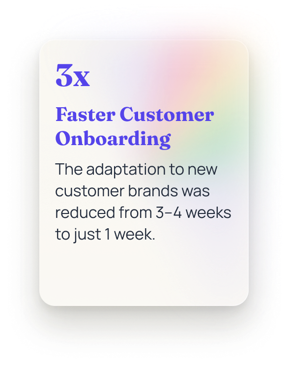
The new design system significantly reduced design and development effort. Changes to brand colors or typography could be applied system-wide within minutes. As a result, the team worked more consistently, and inquiries or rework phases decreased noticeably.


250+ Components,Variants
Focus 2: Governance & Documentation
Context
As the project progressed, the requirements from both the parent company and the American clients changed significantly. Regulatory guidelines demanded detailed, traceable documentation for every feature. The clients also used the Figma file as their own Q&A source, an unusual but binding process. Consequently, existing design documentation was no longer sufficient to meet these rigorous requirements.
Challenge
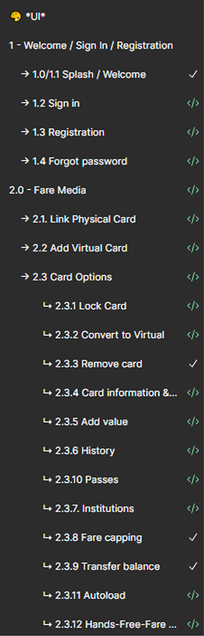
The goal was to uniquely number all components, screens, and feature flows and to document them traceably while maintaining the system's modularity. The structure was designed to provide clear orientation for clients without slowing down the design process.

Sequential numbering of every screen/feature module
Approach
I restructured the Figma file to mirror the app’s navigation model, providing clients with a more intuitive overview. Each page now represents a specific feature and includes a dedicated changelog to document every update for the clients. Feature flows were sequentially numbered and linked using consistent cross-references to simplify navigation and ensure traceability. Additionally, I optimized color codes, layering, and accessibility according to WCAG 2.0 standards, ensuring the system remained accessible and audit-ready. By streamlining Figma license management and removing unused seats, I further improved clarity for developers and project managers.
Before

After

The decision to introduce numbering and changelogs was a strategic move. These elements established trust and transparency with clients accustomed to strictly documented processes. Instead of sacrificing modularity for the sake of documentation, we combined both through clear rules, labels, and system references. This ensured the system remained efficient and usable despite bureaucratic requirements.

Client Feature Matrix
Mini-Challenge: Figma License Restrictions
To make the product scalable for additional clients, a Figma upgrade was required to utilize scalable variable theming.
1.
Accounts consolidated. Redundant accounts validate and removed.
2.
Collaboration simplified. Validated workflows that enabled developers to work effectively without Dev Mode.
3.
Costs stabilized. Maintained consistent pricing despite a 3x increase in individual license costs.
ABT Whitelabel
Outcomes
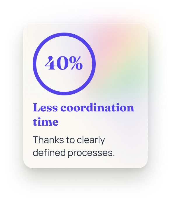
The new structure drastically reduced client inquiries and improved collaboration with developers and project managers. Figma became a traceable, documented system that met both technical and regulatory requirements. The team was able to release features faster without compromising UX quality or system consistency.


Learnings
These two phases in the product lifecycle showed me that great UX design isn't just created in the interface. Only the underlying structure reveals whether a system is robust and documented enough to build trust, both internally and externally. Through this experience, I learned how crucial it is to balance modularity, transparency, and pragmatism, especially as processes become more bureaucratic. Even within tight constraints, UX can have a strategic impact when you consistently focus on creating clarity.


