2 Weeks, 1 Webshop, $200.000
Project/ Product:
Account based Ticketing Webshop
Goal:
Design of a functional preview prototype.
Team composition:
UX Designer, 1 Web Developer, 1 Product Owner, Technical Manager
Role:
Founding Designer/UX-Lead
Focus: Design Impact & Business Value
Context
As Founding Designer, I was responsible for the concept, UX design, and visual branding of a new B2B and B2C solution for the US transportation market. The goal was to develop a compelling prototype that clearly demonstrated the added value of our solution to business stakeholders, thereby laying the foundation for the market launch. The team was small: one Product Owner, one Developer, one Technical Manager, and myself. Working within a tight timeframe and without an external research budget, we aimed to present a product that was functional, credible, and ready for immediate implementation.
Challenge
I was tasked with supporting Management and Sales in convincing customers and external stakeholders that our solution offers a superior value proposition, thereby securing approval for a strategic cooperation. A successful closing would have represented an additional profit of approximately $200,000 per sale. Since the system was developed from scratch, the focus was on a scalable architecture that could later accommodate B2B functionalities. Without a tangible product, however, we lacked the persuasive power to demonstrate this added value.
Approach
I began with a competitive analysis of the product from market competitor Marathon to uncover structural weaknesses, such as redundant calls-to-action and unclear navigation paths.


This resulted in a new information architecture that clearly separated card management and account settings, ensuring better orientation and a cleaner UX.

Parallel to this, based on a brand analysis of the US transportation industry, I developed a visual concept focused on reliability and safety. To enhance the emotional impact, I designed a fictional ideal brand that embodied trust, professionalism, and dependability.

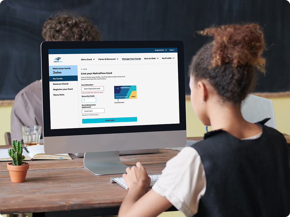
An initial, humorous design approach, inspired by an approachable and friendly brand voice, was perceived by stakeholders as too playful. I responded immediately, sharpening the visual language into a clearly professional, trust-building aesthetic. The greatest lever, ultimately, was connecting the prototype to real backend data, allowing us to demonstrate core functions live. Areas that were not implemented within the timeframe were transparently integrated into the overall journey to maintain the credibility of the vision.
Before

After

My decisions were guided by the "Trust First" principle. In a market where reliability is paramount, the design had to be more than just aesthetic, it had to feel trustworthy. The interplay between emotional design and functional proof was crucial here, aiming to evoke feelings while simultaneously securing credibility. Furthermore, honest scope management was vital, prioritizing transparency regarding limitations over risking trust through over-staging.
Outcomes
By developing a high-fidelity prototype, external stakeholders were convinced and approval for a strategic collaboration was secured. The prototype became a central sales asset with a potential revenue growth of 200,000 USD per deal and sustainably strengthened cross-team collaboration between design, sales, and development.